This is the long-delayed Part 9 of a series about Western Publishing and Gold Key Comics. Even if you followed this series many months ago when the previous installments appeared, you still may need to refresh your memory, which you can do by re-reading Part 1, Part 2, Part 3, Part 4, Part 5, Part 6, Part 7 and Part 8.
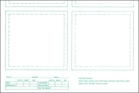
Now then: As I mentioned eons ago in some part of this, back before a lot of their artists drew on computers, comic book companies would often supply drawing paper with the panel borders printed in light blue (and therefore, non-reproducing) ink. Here is a piece of a page that Western Publishing was supplying to its artists back in the early seventies when I worked for them. I have tweaked the image to make the blue ink darker — so you can see it better than it is on the actual page. If you click on the image below, you can see it larger on your computer screen. It's the bottom part of one page…
This paper was printed up by the New York office of Western Publishing for use by their artists and the ones working for the Los Angeles office. As you can see, it specifies how the word balloons should not touch the panel borders. The editors in the L.A. office told their artists and letterers to ignore "that stupid rule" (their term for it) and let balloons touch panel borders. The New York office generally wanted this rule followed though once in a while, they didn't. The Little Lulu comic, which came out of the N.Y. office for some reason changed back and forth.
A few others changed and I know not why but most N.Y. books stuck to this rule. Even when sales were plunging to the level where the entire comic book line was about to go under, no one there looked at what was selling for DC and Marvel and said, "Maybe we ought to not constrict our artists as much as we have."
The page is ruled off into six panels — three tiers of two. It was never intended that any artist just fill in the six panels the way they are. Generally speaking, they could rule each tier off to one, two or three panels (or even four) of varying width. But they were generally expected to layout a page in three separate tiers.
It is my opinion that Western was too rigid in its page formats and that at times, DC and Marvel were too loose with them. I think there was some terrible story-telling in comics with triangular panels and too many "montage" page layouts. An imaginative arrangement of panels can be wonderful and can serve the story well. But you oughta be able to easily figure out which order the panels are to be read in.
This also may be of some interest…
For many years in the industry, the vast majority of comic book art was done to an image area of 12" by 18" or sometimes 12.5" by 18.5". In 1967, both DC and Marvel switched over to an image area of 10" by 15". These were the image areas, not the size of the piece of art board on which the page was drawn. The exact size of that didn't matter. What mattered was the image area. A 10" by 15" page image area was usually drawn on a piece of art board that was 11" by 17".
And what I wanted to point out here was that Western stayed with the larger size after DC and Marvel went to the smaller size. The page I scanned to get the above image had an image area of 12" by 18". That difference meant a lot, pro or con, to some artists.
The "balloons don't touch panel borders" principle was tried on a number of comics at a number of companies. During the years that Carmine Infantino was in charge at DC, they tried it now and then and, because they did it without resorting to square balloons, I don't think a lot of readers noticed. It often crowded the art though. I think of it as a well-intentioned bad idea that happily never caught on. Western Publishing was the only place I know of where it was tried for an extended period but it was just one of the many points of friction between the two offices.
One of the days, I may think of some others to write about here…and also some of the other things that Western did that other companies didn't. But this is the final installment of Border Crossings for now. Sorry it took so long to get it all here on the blog.
