
After too long a pause, here's the next part of this series. You might wish to refresh your memory by reading the First Part, the Second Part, the Third Part, the Fourth Part, the Fifth Part and, yes, even the Sixth Part.
During the years I wrote Gold Key Comics for the Los Angeles office of Western Publishing, I heard a great many stories about the company. Some of them were about problems with the New York office. The two divisions had very little contact and overwhelmingly, what they had was professional and pleasant and involved both towards for the same goal, which was to put out the best possible comics to achieve the best possible sales.
But of course, there were what we might politely call "differences," some of which flowed from the fact that the way things were set up, the N.Y. office did the final production phases of getting comics off to press. For example, the comics were all colored in New York. Who did the actual coloring? I don't know and neither did the folks who ran the L.A. office. They'd send the finished line art back east and that was the end of it as far as they were concerned. Often — and by "often," I mean like all the time — they didn't like what the New York colorists did, especially on the interiors.
No, I take that back. Once in a while, they liked the interiors but from what I can tell, that "while" was a rare while. They also liked the coloring of the covers if and when it adhered to an old Western Publishing company policy. One person — and I wish I knew the name of any of the people in charge of this — would color all the covers with an eye towards the on and off-sale dates. The goal was to see that no two Gold Key comics that were on sale at the same time had the same color schemes on their covers.
This applied only to the line art and not to the paintings and I have no idea why. An awful lot of the painted covers, particularly on the "ghost" books (The Twilight Zone, Grimm's Ghost Stories, etc.) looked very much alike to me and not just because most of them were painted the same man…George Wilson. They were often excellent paintings but a lot of them looked the same to me. Mr. Wilson, by the way, did not paint every single cover but since those who now try to affix credits now on artwork aren't familiar with the other painters, they often slap Wilson's name where it doesn't belong.
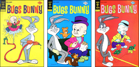
The person in charge of coloring the line art colors back east would take all the black-and-white versions of covers that would be on-sale at the same time and put them on a big easel or pin them to a wall. The idea was to see all of them at the same time. Then he (or she) would designate: "This issue of Bugs Bunny will have a yellow background and a blue logo while this issue of Pink Panther will have a green background and a white logo and this issue of Woody Woodpecker will have a blue background and a pink logo…"
This was more complicated than it might seem because at the same time, this color coordinator would have to make sure that no two consecutive issues of any comic had similar coloring. This was a practice at some other companies, as well: The cover of the February issue had to be quite different from the cover of the January issue so that folks browsing the newsstands wouldn't think they already had that issue. The theory was that if you weren't sure if you'd already bought it, you wouldn't buy it.
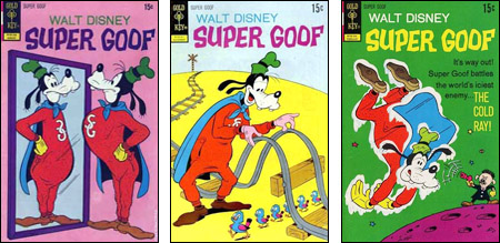
And we're now into another one of those things that I've never seen discussed in any fanzine or fan forum. If you're intrigued by this aspect of comic creation, take a look at the covers of Marvel's Captain America comic, especially in the seventies. Once it was decided that the logo would always be red, white and blue, that limited the number of background colors available to the person coloring the cover. You could have a white background but you couldn't use red or blue because then the logo wouldn't "pop." Not only that but green and purple looked odd with a red, white and blue logo. So for a long string, they did it the easy way. The background colors on Captain America were white, black and yellow in rotation.
And the cover colorist at Western had another handicap: Some characters are always certain colors. You couldn't use a pink background on a Pink Panther cover unless the idea was to have your star blend into the background instead of stand out. Ideally, you'd want Tweety to be the only thing that was yellow on a Tweety & Sylvester cover. Woody Woodpecker had the same color scheme as Captain America and therefore his comic presented much the same problem.
At least, that's the way it was supposed to work. When the unknown cover colorist in New York screwed up, angry memos would fly back and forth. The New York office was also in charge of the logos on the covers.
In some cases, the company that owned a great cartoon character and licensed it to Western had a logo design which was used whenever appropriate. Someone in the dustant past of Western — I dunno who, I dunno when — had this idea that they could always craft a better logo than Walt Disney's artists, Walter Lantz's artists, Jay Ward's artists, etc. That became a company tradition so they tried, not always with the greatest results.
Now and then, a licensor would insist on his logo but for the most part, Western liked to design their own and the New York office did those — and not just for the comic books. Remember: Western was also producing coloring books, activity books, novels for young readers, jigsaw puzzles and other items, often featuring the same licensed characters.
Chase Craig, who headed up the L.A. office, thought a lot of their logo designs were horrible but as with the coloring, this was a battle that he simply was not going to win. We all have those in our lives. There was one time that I designed the logo for a Gold Key comic and I did it without knowing I was doing it. I told that story here.
So the two offices fought over the coloring and they fought over the logos. They also sometimes quarreled over jurisdiction — which coast would do the comic based on a new license that Western Publishing had acquired. I'll tell a couple of stories about that in our next installment and, sooner rather than later, I'll get back to the raging controversy over panel borders touching word balloons. I promise.