Hi. Before you venture into the sixth part of this series, it might be a good idea to read the First Part, the Second Part, the Third Part, the Fourth Part and, just for good measure, the Fifth Part…
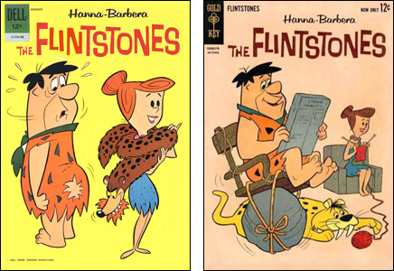
All up to date? Good. So when we last left me, I was ten years old and wondering why many (but not all) of my favorite Dell comic books had suddenly turned into Gold Key comic books. Here is a simple before-and-after of one of those comics. At left is The Flintstones #6 with a cover by Harvey Eisenberg, It's Fred mooning the readers. At right is The Flintstones #7 with a cover by Pete Alvarado…

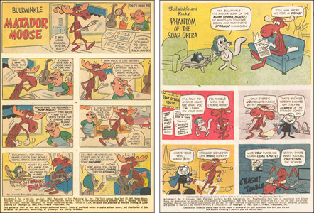
As you can see, apart from a different symbol in the upper left hand corner, not much difference. There was not much difference inside, either but some of these comics changed as they passed from Dell to Gold Key. Below left we have the first page of the last Dell comic of Bullwinkle and at right, we have the first page of the first Gold Key issue of Bullwinkle. For this, it will help if you click on the image to make it larger on the screen…
See the difference? I don't know the names of the artists on the two pages except that they're not the same person and neither one of them is Al Kilgore. But the two pages have the same letterer — Ben Oda, who in his long career lettered an insane number of comic books for half the companies in the business. The difference in the word balloons was not Ben's idea. He was just doing what he was told by his editor.
They dispensed in this story with the traditional panel borders. They put the words in oddly-shaped balloons and floated them away from the edges of the panels so the white of the balloon did not meet the white of the gutters between the panels. This was supposed to make for better coloring since the colorist didn't have to deal with a huge blob of white in each panel throwing the color compositions off-balance. They also reduced the "tail" (the pointer) on each balloon to a single line…and to do all this, they put fewer words in each balloon and limited the amount of space the artist had to draw in.
Personally, I thought it was a bad idea. But suddenly, a lot of Gold Key comics were doing this to some (not all) stories in each issue.
As I mentioned in an earlier chapter that I'm too lazy to look up, some of the comic books produced by Western Publishing — at first under the Dell label, later under the Gold Key imprint — were produced out of an editorial office in Los Angeles and some were done in an editorial office in New York. There were several editors in each office but the main guy in L.A. was Chase Craig and the main guy in New York then was Matt Murphy.
Chase Craig was a traditionalist when it came to doing comics. (Full Disclosure: He was my main editor when I wrote comics for Western in the early seventies. He was a lovely man who was very good to me and he taught me a lot. He was also the primary — but by no means the only — person who gave me the information I am imparting to you in this series.) Matt Murphy was of the opinion that the switchover from Western producing comics for another company to Western producing them for their own company was the perfect time to try reinventing not so much the contents of the comic books as the graphic style. (Full Disclosure: I never met Matt Murphy but I met many of his associates.)
The two above issues of The Flintstones were edited by Chase Craig out of the Los Angeles office of Western Printing and Lithography. The two above issues of Bullwinkle were edited by Matt Murphy out of the New York office of Western Publishing and Lithography. Chase and Matt fought a lot.
I don't mean they were bitter enemies. They got together for friendly conferences and meals a few times a year on one coast or the other. They agreed on a lot of things. They just didn't agree on everything…and among the non-agreements were many of Murphy's ideas of changing how comics looked. To complicate matters, the New York office did most of the production work on covers, including things like title logos and lettering placement, and the coloring of all the interiors. Though he was in charge of roughly half the line, Chase did not have final say on the coloring on the comics he edited and he often disliked it a lot.
When Murphy persuaded the folks upstairs to try some of his innovations, Craig was told to apply them to the West Coast books. He balked and stalled…and he had an advantage. Most of the comics he edited had long-range contracts and were in no danger of being canceled so he was allowed to get them way ahead of schedule. He had issues of Mickey Mouse that had been completely drawn for the "old" format and wouldn't be going to press for a year.
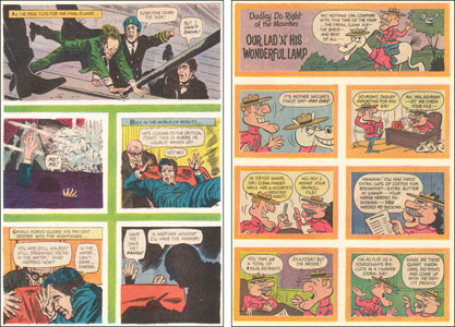
But a lot of New York books were doing these experiments with no panel borders or balloons not touching panel borders or one-line tails on word balloons or color in-between the panels. Here are pages from two New York books from this period. And again, you can make the image larger by clicking on it…
I don't know who did the page on the right but the one on the left was drawn by Mike Sekowsky for the Boris Karloff Thriller comic. And both were, again, lettered by Ben Oda.
According to Chase, the New York office had the idea that these new approaches made the comics feel more sophisticated and set their books apart from what the other comic book companies were doing. They were "gung ho" (that was the term Chase used) to make the whole line like that, even printing up new page blanks for the artists to draw upon.
Comic book companies have occasionally done that. They print up sheets of quality (hopefully) drawing paper that are cut to the proper size and they print guidelines on each piece in light blue ink. The artist then fills in the blanks. It saves them from having to buy paper, cut it to size and then rule off the size of the image on the page and where the gutters between the panels will go. Also, if the penciler buys his own paper, others who work on it (like the letterer or inker) may complain they don't like his choice of drawing paper.
When a comic book page is finished in ink and is photographed for printing, light blue ink doesn't reproduce unless the camera guy or scanner makes special adjustments…so it can become invisible in the final image. Western printed up pages with the margins for the art indicated in light blue and within each panel, there were margins to show how far from the panel borders (that were not going to be inked with black lines) the word balloons should be.
At first when Chase passed out these new page blanks to the artists drawing for him, Chase told them to ink in the panel borders and to ignore the dotted line margins that kept the word balloons away from the panel borders. And when he did that, a kind of intra-company Civil War broke out.

