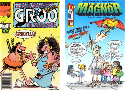
My pal Tom Brevoort, who supervises many a fine comic book at Marvel, read what I had to say about word balloons on comic book covers and sent this add-on…
A bit of additional nuance for you concerning the reason why word balloons and copy aren't used on covers so much as they once were. Everything that you stated is absolutely correct, but in my experience, there's another factor at play that caused everybody to scale back on the use of copy on covers. And that concerns the changing tastes of the audience.
I don't know where the sentiment came from necessarily — possibly a backlash against all of those silly early 1960s DC text-heavy covers that we all remember. But at a certain point, the hardcore fan cognoscenti reached the unshakable conclusion that word balloons on a cover made it look juvenile. Now, as you know, there is nothing that an insecure young comic book reader fears more that being pigeonholed as somebody who reads "kid's stuff" by their peer group. So as this sentiment penetrated into the fandom, especially as more and more business ran through the Direct Sales marketplace which sold on a non-returnable basis to stores and consumers — stores that, in many cases, were opened by people who had previously been fans, some of whom based their ordering decisions on their own likes and tastes as much as anything else.
This feeling also began to extend largely into the creative community, who were also a bit afraid of having their work seen as juvenile, especially during the era when grim and gritty was the common shorthand for what was considered good by the audience at large. (A sidebar — this is also what happened to thought balloons in general. Once Frank Miller introduced first person narration as the way in which tough guy characters revealed their inner thoughts to the readership in a literary style, every writer worth his salt abandoned thought balloons and first-person narration became a dime a dozen. And even when that narration largely went away, the thought balloons didn't grow back, they were simply gone for the most part.)
And once the word balloons went, it was only a matter of time before any other copy on covers was likewise deemed unattractive. For the longest time, the people who worked as art directors or cover editors at the major two comic book companies would evoke a study that had been conducted many years earlier, which showed that a cover that had copy on it would be looked at by a prospective consumer for a fraction of a second longer than one without — it took that long for the average person's brain to decipher the text. And so cover copy was for the longest time mandatory. But as those art directors, et al left, they were replaced by a new generation that either weren't aware of that study or who gave it no credence, and who felt that the purpose of a cover was to provide a strong piece of art, a compelling image that would draw a prospective reader into buying the book.
Who is right? Who can say? It's possible to do great covers without copy and it's possible to do great covers with copy. No one approach is the only one, all tools in the toolbox should be valid. But this is in large part the reason why so relatively few covers employ cover copy today.
I agree with all that. And I'll add that I think the whole attitude about cover design has changed over the years, in part because someone finally realized that there was no evidence that cover blurbs and balloons led to higher sales but that there was some indication that visually-arresting covers did. Largely gone are the days when someone in the office would crank out layout sketches for a dozen covers and then Gil Kane or Nick Cardy or someone would take them home, draw covers following the sketches and than the office would slap lettering on it.
This discussion started here with an e-mail from Ken Scudder asking me who was responsible for word balloons on a cover. It might advance this conversation if I mention that my partner Sergio Aragonés, being a master of pantomime cartooning, believes that covers should never have lettering on them above and beyond the title logo, price, issue number, etc. Comics on which he and I have collaborated have resulted in well more than 200 covers and unless there was one that has fled my memory, we've had word balloons on a grand total of two…

The way we handle covers is that at some point in the process, someone tells Sergio we need to have a cover drawn and Sergio just sits down and draws a cover. No one does a sketch for him. No one approves his designs although I've made suggestions on one or two covers but not many more than that. I think they've all turned out fine.
When he drew the cover of Groo #18, he surprised the heck outta me by putting a word balloon on it. That's his lettering even. When he drew one of the covers for The Mighty Magnor #1 (it had several), he surprised me again by drawing the above, leaving space for word balloons and telling me to add them. I wrote and lettered them. In case anyone's interested, the blurb that starts "First Time Ever…" was penciled by me and inked by him. These were rare exceptions.