Last year, as reported here, the United States Postal Service announced (and earlier this year, issued) a sheet of postage stamps featuring ten characters from DC Comics. I almost typed "properties from DC Comics" because the images were obviously selected with merchandising considerations in mind. Many fans wondered why one hero was selected over another, and the answer is that at any given moment, the company has reasons to promote one hero over another. Some of those would include making sure the heroines are represented, which is not a bad reason.
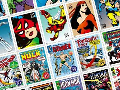
To no one's surprise, a pane of Marvel stamps has just been announced for 2007. No specific release date is given in the press release you'll find if you scroll way down this page, but I'm guessing it'll coincide with that year's Comic-Con International in San Diego. One hopes that Marvel will do what DC did, which was to foot the bill to arrange the presence of the artists who are still with us and whose work is depicted on the stamps…or at least, as many of them as were able to attend. In Marvel's case, it won't be as many.
Before they can do that though, we have to correct some of the artist identifications on the press release…and these names are also being printed on the obverse side of the stamps. They have a Sub-Mariner portrait credited to Gene Colan when it's actually by John Buscema. They have a Captain America portrait credited to John Romita when it's actually by Jack Kirby. (That one's off the cover of Tales of Suspense #59, which was done years before Romita came back to Marvel.) I think the Spider-Woman drawing is Romita not Infantino and the Hulk drawing — I'm not sure where it's from — may have been pencilled by John Buscema but the linework and face are definitely John Romita. Some of the cover images are credited to both penciller and inker and some only to the penciller. Joe Sinnott, Frank Giacoia and Syd Shores are therefore among the uncredited. It would be nice to get these right, especially if Marvel's going to spring to get some of these folks — the few who are still with us — out to San Diego.
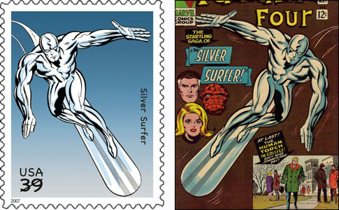
Also, continuing with my complaints, the art has not been treated well. The ten cover drawings have been squished to fit the stamp proportions. (This was done with the DC stamps but it was not as overt.) Also, there's an art oddity in there…and yes, I know this is quite trivial. The Silver Surfer stamp is a flop. I don't mean it's a failure. "Flop" is the term when a drawing is flipped mirror-image. In this case, it's the cover of Fantastic Four #50. Years ago, someone pulled the drawing — by Jack Kirby and Joe Sinnott — and flopped it to fit some specific composition in an ad or piece of merchandising. It's been used and re-used over and over since then and no one's ever bothered to flip it back or to return to the original. The drawing works that way, of course, but it's a wee bit off in subtle ways.

Lastly, since I'm being an unrelenting kvetch here, I'll complain about one more thing. Marvel has routinely employed some very talented letterers and there are also many wonderful fonts out there that replicate great comic book hand lettering. There is also a very common, awful font called Comic Sans that no one would ever use in a Marvel Comic because it's so ugly and sloppy. Whoever designed these stamps used Comic Sans for the new lettering.