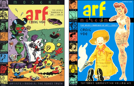
I had a very good time last evening reading the first two volumes in what I hope will be a long series from Craig Yoe — Arf Museum and Modern Arf. These are nice books from Fantagraphics in which Craig has picked out interesting items of comic art from his, and I suppose some other folks' collections. There are panel cartoons, stories, illos…diverse material that is somehow united by Craig's mere celebratory selection of it. It's hard to explain why. It may be no deeper than that Mr. Yoe likes the same kind of stuff I do. Anyway, I suggest either ordering them or at least paging through them at a store or convention, which will lead to you wanting to buy them. Great stuff.
Above and beyond the fascinating contents, there's something else very nice about these books: They're beautifully designed and totally legible. Lately, those two virtues have seemed mutually exclusive in the book world. I've gotten a lot of books that were quite lovely to page through but at some point, I found myself unable to actually read some extended section of text. Somehow, it was more important that the designer put a busy color pattern behind a flimsy type font or something…and you can almost hear someone say to someone else, "It's okay. There's plenty of other text here they can read if that's what they want."
The other day, I received a printed copy of a book for which I wrote an article and I cannot read my own text. I have 20/20 vision and I kinda already know what it says…but I still can't make out what I said in some paragraphs. This is not a trivial complaint, nor is it particularly arguable. The last time this happened to me, the company's art director had all sorts of defenses. Apparently, the aesthetics of unified thematic composition required a certain page layout and the fact that it rendered some of those pages unreadable was just nitpicking on my part. I felt so foolish.
Anyway, that's not a problem with Craig's books. Just one of the reasons you'll enjoy them.